Chapter 2 Summarising data
In this chapter, we’re going to look at data frames, which is a way of grouping data in R, and how we can present some summary statistics from them. We’ll also see how to import data from a file.
2.1 Data frames
The idea of a data frame is similar to a single spreadsheet, where we group together a set of data for multiple attributes for multiple observational units.
For example, the built-in dataset mtcars contains information on (now classic) cars. We can see the first few rows of the dataset by doing the following. For more information on what this dataset means, look at its help file.
data(mtcars)
head(mtcars)
## mpg cyl disp hp drat wt qsec vs am gear carb
## Mazda RX4 21.0 6 160 110 3.90 2.620 16.46 0 1 4 4
## Mazda RX4 Wag 21.0 6 160 110 3.90 2.875 17.02 0 1 4 4
## Datsun 710 22.8 4 108 93 3.85 2.320 18.61 1 1 4 1
## Hornet 4 Drive 21.4 6 258 110 3.08 3.215 19.44 1 0 3 1
## Hornet Sportabout 18.7 8 360 175 3.15 3.440 17.02 0 0 3 2
## Valiant 18.1 6 225 105 2.76 3.460 20.22 1 0 3 1There are multiple rows and columns.
- Each row represents a single observation, in this case on a different type of car
- Each column represents a different type of information, in this case an attribute of a car, such as it’s
mpg(miles per gallon), orcyl, the number of cylinders.
It’s important to get into this mindset that each row is a different observational unit (e.g. a different type of car), and each column contains some attribute about this data (e.g. the miles per gallon, number of cylinders, etc.) In excel, and other spreadsheets, we do not need to be as formal about it, but for R this is an important feature we try to stick to- this is called tidy data.
We can give the columns meaningful names, which is useful- in excel, to refer to a column we would have to remember it is column P, or whatever, but in excel we can just refer to column ‘mpg’ for example.
In this chapter we’ll learn the basics of how to work with data frames, these fundamental collections of data.
There are some more advanced methods of working with data, which uses the tidyverse, but as always in this course we are focusing on building a foundation- there’s plenty of time if you want to learn these more advanced methods later.
2.1.1 Creating a data frame
In this section, we’ll cover creating a data frame from scratch and doing simple manipulations using the base R commands and syntax.
To create a data frame, we have to group some column vectors together. The command data.frame() does exactly that. In the example below, I list the names, ages and heights (in inches) of a well-known family.
family <- data.frame(
  Names = c('William', 'Kate', 'George', 'Charlotte', 'Louis'),
  Age   = c(40, 40, 9, 7, 4),
  Height.in = c(72, 66, 47, 42,36)
)
family
## Names Age Height.in
## 1 William 40 72
## 2 Kate 40 66
## 3 George 9 47
## 4 Charlotte 7 42
## 5 Louis 4 36Typing family will display the data frame. To access a particular column, we can use the $ operator. We could then do something like calculate the mean or standard deviation.
family$Age## [1] 40 40 9 7 4mean( family$Age )## [1] 20sd( family$Age )## [1] 18.34394As an alternative to the “$” operator, we could use the [row, column] notation. To select a particular row or column, we can select them by either name or location.
family[ , 'Age'] # all the rows, Age column## [1] 40 40 9 7 4family[ 2, 'Age'] # age of person in row 2## [1] 40Next we could calculate everyone’s height in centimeters by multiplying the heights by 2.54 and saving the result in column appropriately named.
family$Height.cm <- family$Height.in * 2.54  # calculate the heights and save them as a new column!
family                                       # view our result!
## Names Age Height.in Height.cm
## 1 William 40 72 182.88
## 2 Kate 40 66 167.64
## 3 George 9 47 119.38
## 4 Charlotte 7 42 106.68
## 5 Louis 4 36 91.442.1.2 Summary statistics
One of the first things to do when investigating a dataset is to present some summary statistics for the data.
For categorical data, presenting some summary statistics, or tabulating the data might help us to understand it more.
For example, consider the data set diamonds in the ggplot2 package. To load the data set in, install this ggplot2 package using the “Tools->Install Packages” menu, and then run
library(ggplot2)
head(diamonds)
## # A tibble: 6 x 10
## carat cut color clarity depth table price x y z
## <dbl> <ord> <ord> <ord> <dbl> <dbl> <int> <dbl> <dbl> <dbl>
## 1 0.23 Ideal E SI2 61.5 55 326 3.95 3.98 2.43
## 2 0.21 Premium E SI1 59.8 61 326 3.89 3.84 2.31
## 3 0.23 Good E VS1 56.9 65 327 4.05 4.07 2.31
## 4 0.29 Premium I VS2 62.4 58 334 4.2 4.23 2.63
## 5 0.31 Good J SI2 63.3 58 335 4.34 4.35 2.75
## 6 0.24 Very Good J VVS2 62.8 57 336 3.94 3.96 2.48This is a large dataset, with each row consisting of some data on the properties of a large number of diamonds. We can find out how large by running the following command.
dim(diamonds)## [1] 53940 10R tells us it is 53,940 rows and 10 variables (which matches the help file), representing ten pieces of information on each of 53,940 diamonds.
We maybe want to summarise the diamonds’ cut, and their clarity.
table(diamonds$cut)##
## Fair Good Very Good Premium Ideal
## 1610 4906 12082 13791 21551table(diamonds$color)##
## D E F G H I J
## 6775 9797 9542 11292 8304 5422 2808Staight away we have a good summary of large amount of data. If we want to look at two categories at once, we can find a crosstabulation of the data
table(diamonds$color,diamonds$cut)##
## Fair Good Very Good Premium Ideal
## D 163 662 1513 1603 2834
## E 224 933 2400 2337 3903
## F 312 909 2164 2331 3826
## G 314 871 2299 2924 4884
## H 303 702 1824 2360 3115
## I 175 522 1204 1428 2093
## J 119 307 678 808 896A summary of this type is a very useful start for examining qualitative data.
2.1.3 Quantitative data
We can perform similar summaries for quantitative data. Common things we may wish to know is measures of location we are familiar with: mean, or median, for example.
mean(diamonds$carat)## [1] 0.7979397median(diamonds$depth)## [1] 61.8Measures of spread such as variance, standard deviation, and interquartile range are of course also readily available
var(diamonds$depth)## [1] 2.052404sd(diamonds$price)## [1] 3989.44IQR(diamonds$carat)## [1] 0.64A useful command for summarising a data frame is the summary command.
summary(diamonds)## carat cut color clarity depth
## Min. :0.2000 Fair : 1610 D: 6775 SI1 :13065 Min. :43.00
## 1st Qu.:0.4000 Good : 4906 E: 9797 VS2 :12258 1st Qu.:61.00
## Median :0.7000 Very Good:12082 F: 9542 SI2 : 9194 Median :61.80
## Mean :0.7979 Premium :13791 G:11292 VS1 : 8171 Mean :61.75
## 3rd Qu.:1.0400 Ideal :21551 H: 8304 VVS2 : 5066 3rd Qu.:62.50
## Max. :5.0100 I: 5422 VVS1 : 3655 Max. :79.00
## J: 2808 (Other): 2531
## table price x y z
## Min. :43.00 Min. : 326 Min. : 0.000 Min. : 0.000 Min. : 0.000
## 1st Qu.:56.00 1st Qu.: 950 1st Qu.: 4.710 1st Qu.: 4.720 1st Qu.: 2.910
## Median :57.00 Median : 2401 Median : 5.700 Median : 5.710 Median : 3.530
## Mean :57.46 Mean : 3933 Mean : 5.731 Mean : 5.735 Mean : 3.539
## 3rd Qu.:59.00 3rd Qu.: 5324 3rd Qu.: 6.540 3rd Qu.: 6.540 3rd Qu.: 4.040
## Max. :95.00 Max. :18823 Max. :10.740 Max. :58.900 Max. :31.800
## It attempts to do everything at once; for categorical data (the categories are called factors in R), we get a list of how many are in each category. For numerical data, we get minimums, maximums, quartiles, medians and means.
2.2 Plotting Data
There are two major “systems” of making graphs in R. The basic plotting commands in R are quite effective but the commands do not have a way of being combined in easy ways. The more modern but complicate package, ggplot2, we look at in the next chapter.
2.2.1 Plots in base R
Plotting using base R (i.e. without loading any additional packages) is more than possible. It is easy to start with, but customisations are difficult.
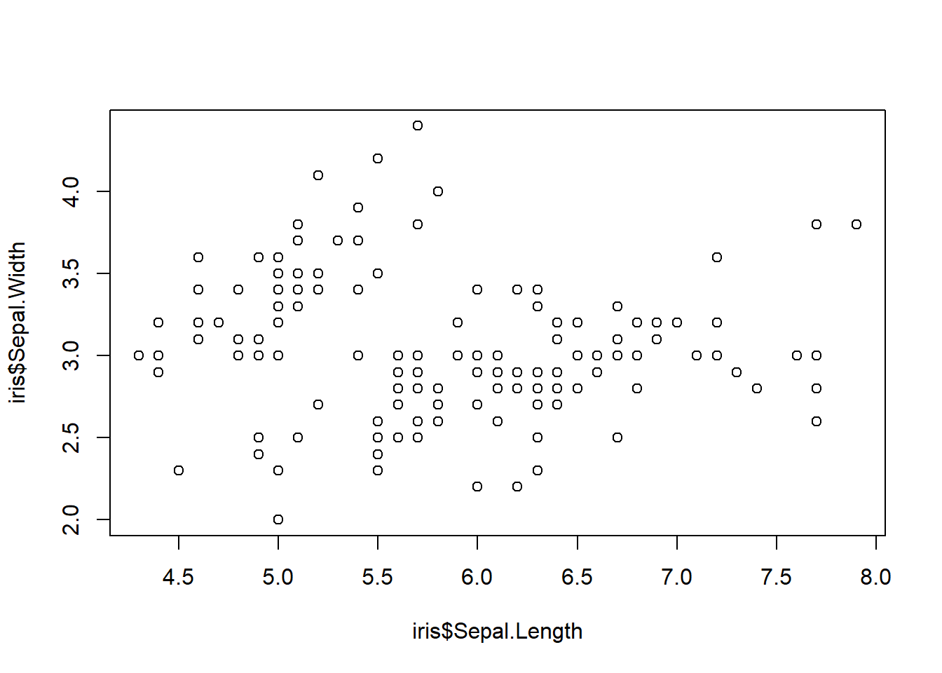
To start with, we’ll make a very simple scatterplot using the iris dataset. The iris dataset contains observations on three species of iris plants where we’ve measured the length and width of both the petals and sepals. We will make a scatterplot of Sepal.Length versus Petal.Length, which are two columns in the dataset.
data(iris)  # load the iris dataset that comes with R
str(iris)   # what columns do we have to play with...
## 'data.frame': 150 obs. of 5 variables:
## $ Sepal.Length: num 5.1 4.9 4.7 4.6 5 5.4 4.6 5 4.4 4.9 ...
## $ Sepal.Width : num 3.5 3 3.2 3.1 3.6 3.9 3.4 3.4 2.9 3.1 ...
## $ Petal.Length: num 1.4 1.4 1.3 1.5 1.4 1.7 1.4 1.5 1.4 1.5 ...
## $ Petal.Width : num 0.2 0.2 0.2 0.2 0.2 0.4 0.3 0.2 0.2 0.1 ...
## $ Species : Factor w/ 3 levels "setosa","versicolor",..: 1 1 1 1 1 1 1 1 1 1 ...We’ll use this built in data set iris to demonstrate a couple of very easy plots.
plot(iris$Sepal.Length,iris$Sepal.Width)
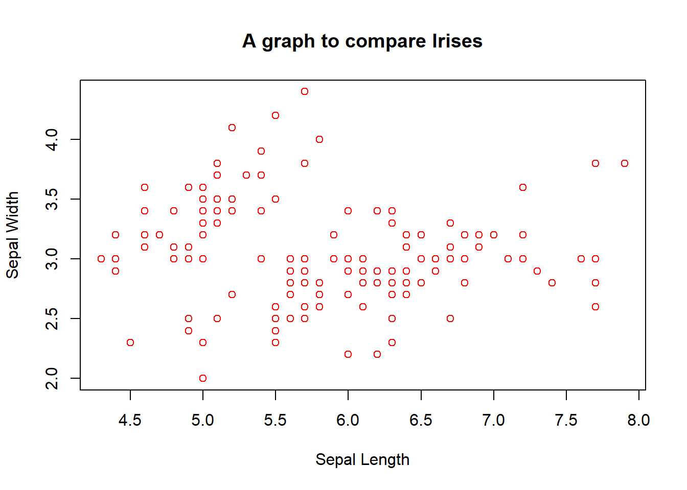
This is sometimes useful for a quick and dirty approach, and adding labels is fairly straightforward, e.g.
plot(iris$Sepal.Length,iris$Sepal.Width,main="A graph to compare Irises",xlab="Sepal Length", ylab="Sepal Width", col="red")
We can also easily conjure up other standard graphs:
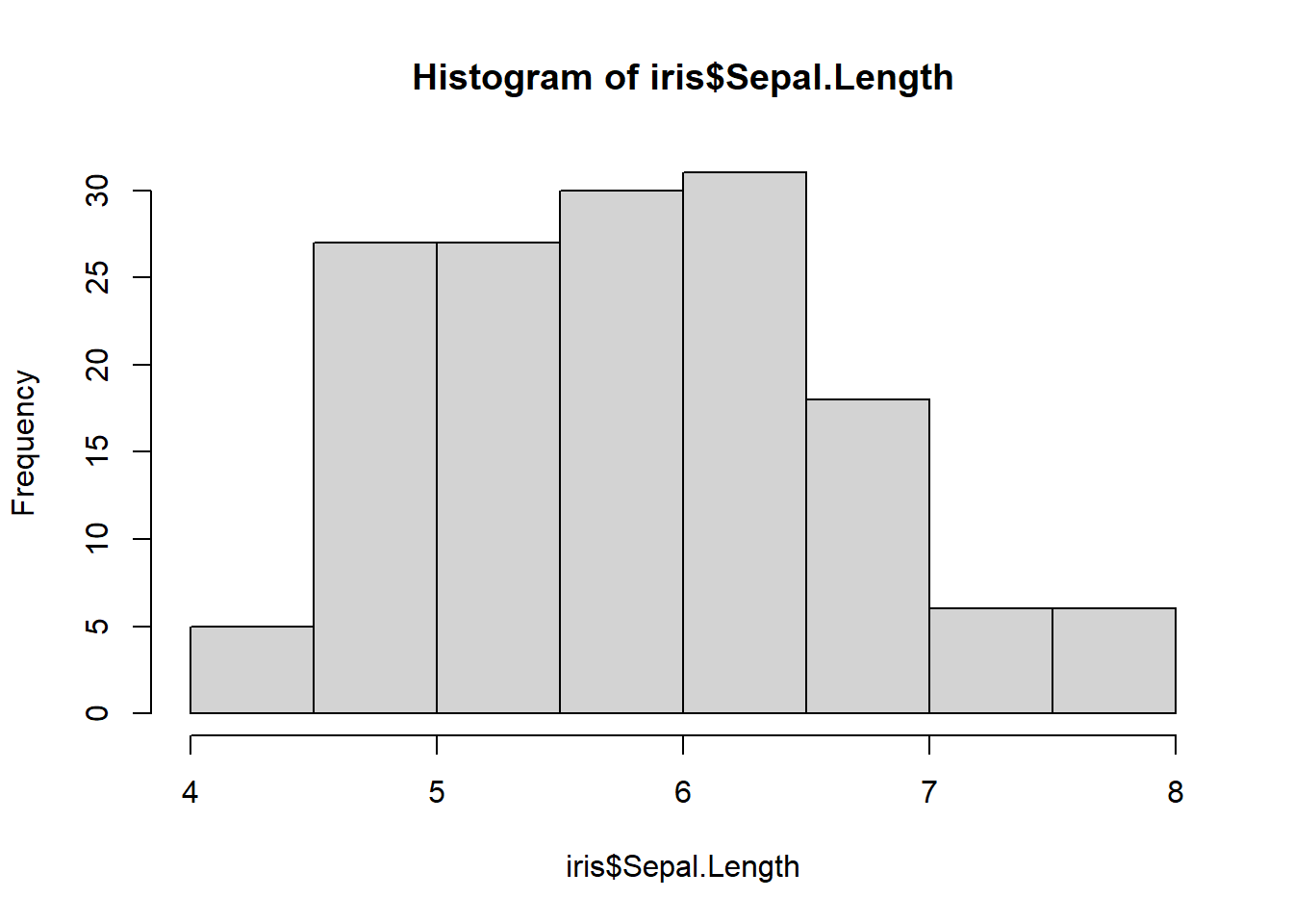
hist(iris$Sepal.Length)
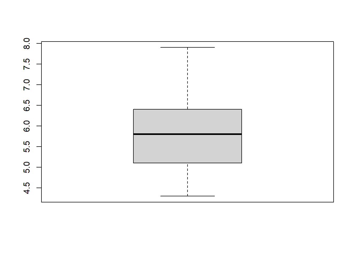
boxplot(iris$Sepal.Length)
The histogram is relatively self-explanatory, but I reallyh like the boxplot for getting a clear idea of the spread of data. Remember that a boxplot shows clearly the minimum, lower quartile, median, upper quartile, and maximum.
I find using these simple plots very good for my own use, but for even better possibilities, ggplot2 coming up soon is a lot more flexible and prettier!
2.3 Exercises
Create a data frame “by hand” with the names, ages, and heights of your own family. If this feels excessively personal, feel free to make up people or include pets. Calculate the mean age among your family.
Use the
mtcarsdataset to calculate the mean fuel efficiency using thempgcolumn.Examine the dataset
trees, which should already be pre-loaded. Look at the help file using?treesfor more information about this data set.
- Produce summary statistics of these data. What can you say about the trees?
- Produce boxplots and histograms of the Height, Volume and Girth of the trees. Which do you find more useful?
- Build a scatterplot that compares the height and girth of these cherry trees to the volume of lumber that was produced. Create a graph with Height on the x-axis, Volume on the y-axis?
- Add appropriate labels for the main title and the x and y axes.