Chapter 9 Linear Regression
Here is an describing a little of the theory of linear regression, as well as covering how to do it in R.
embed_url("https://www.youtube.com/watch?v=-7LHOpWGfMc")9.1 Regression and residual diagnostics
We start by loading a faithful old data set, the ``old faithful’’ data set. This should be built in to most versions of R, and you can access it by typing ‘faithful’, and tells us the waiting time between eruptions and the duration of the eruption for the Old Faithful geyser in Yellowstone National Park, Wyoming, USA.
data("faithful")
head(faithful)
## eruptions waiting
## 1 3.600 79
## 2 1.800 54
## 3 3.333 74
## 4 2.283 62
## 5 4.533 85
## 6 2.883 55Type help(faithful) to see all the details about this data set.
Let’s fit a model first of all, by the following commands:
yellowstone.lm<-lm(eruptions~waiting,data=faithful)
 plot(faithful$waiting,faithful$eruptions,xlab="Waiting time",ylab="Eruption duration")
 abline(yellowstone.lm$coef)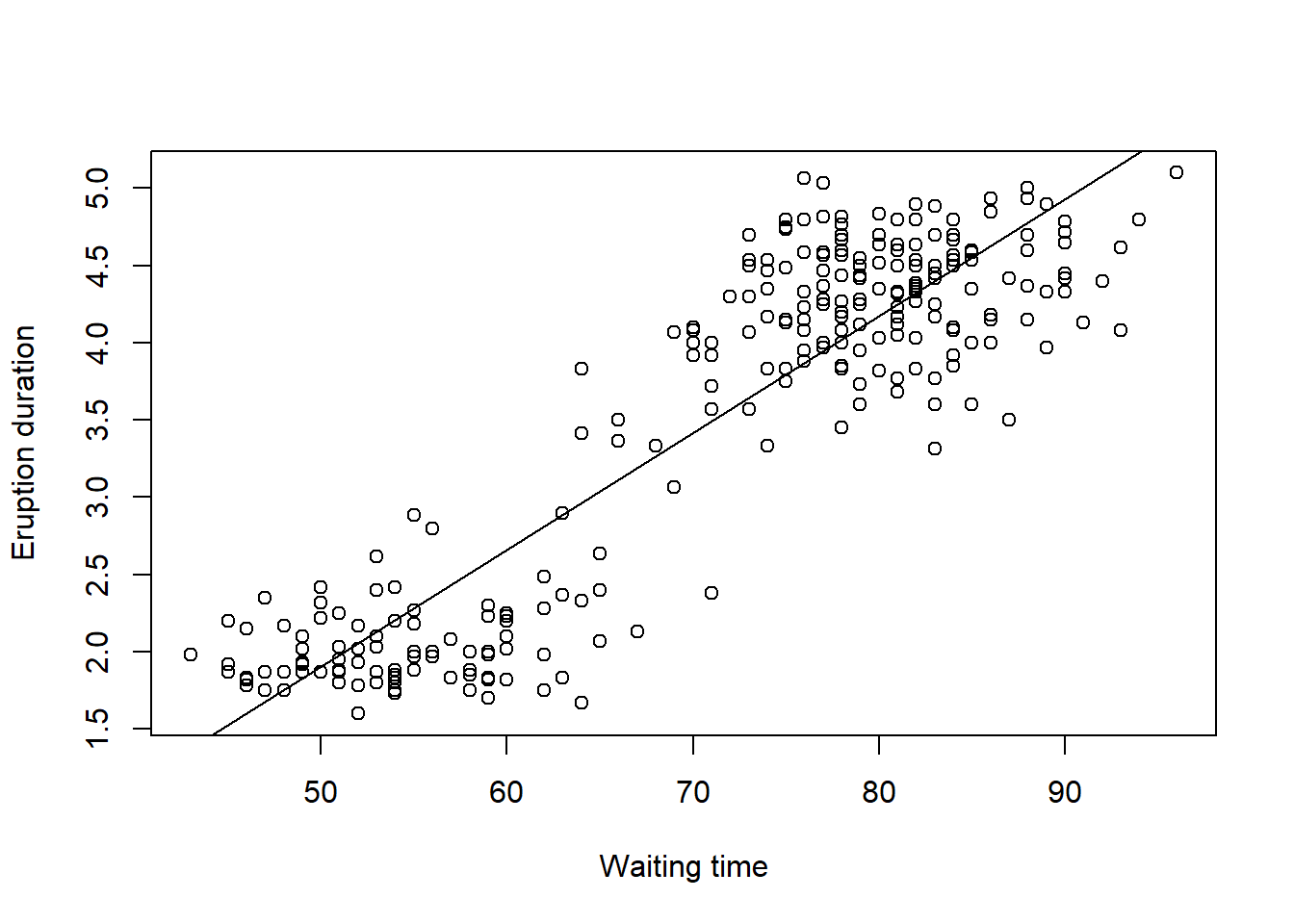
When we are fitting a linear model, say \(y\) against \(x\), we are in effect trying to draw a line of best fit through the data with the equation for the line given by \[y=\beta_0+\beta_1 x\] where \(\beta_0\) is the intercept, and \(\beta_1\) is the slope of regression. The aim in the regression is to fit the line as well as we can, where we want to minimise some function of the vertical distances between the points and the line. We call these distances the residuals.
In order to find the best line, we find the line which we draw through the data which minimises the sum of all the squares of the residuals. The (unique) values of \(\beta_0\) and \(\beta_1\) which do these are known as the least squares estimate.
If the model is a good one, then we expect our residuals to be normally distributed, identically distributed, and independent of each other. We can look at the residual plots to assess the how well the model fits.
plot(yellowstone.lm)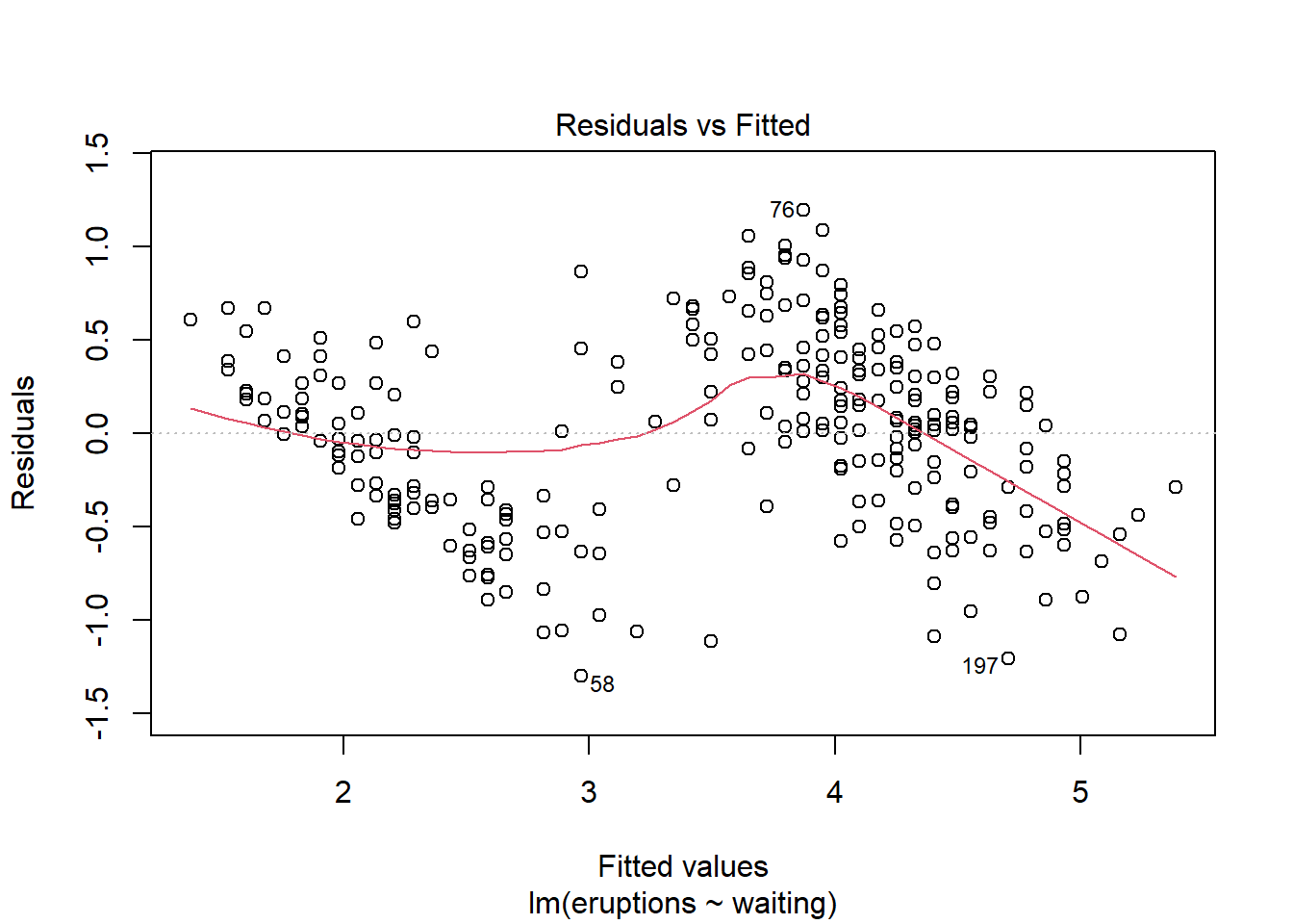
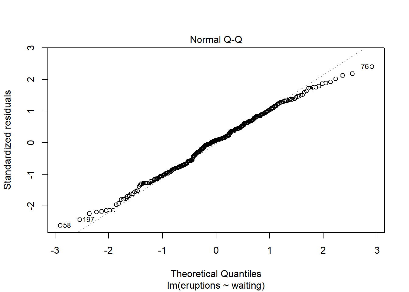
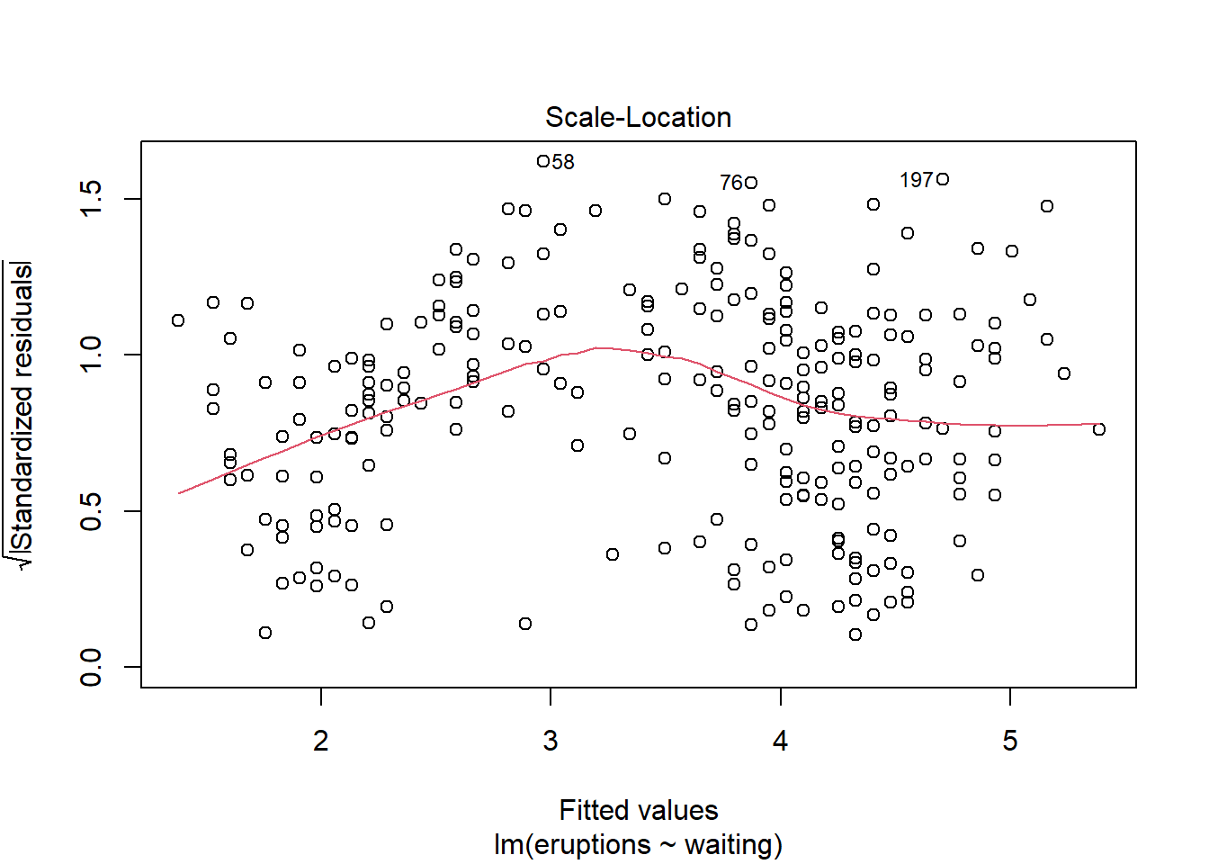
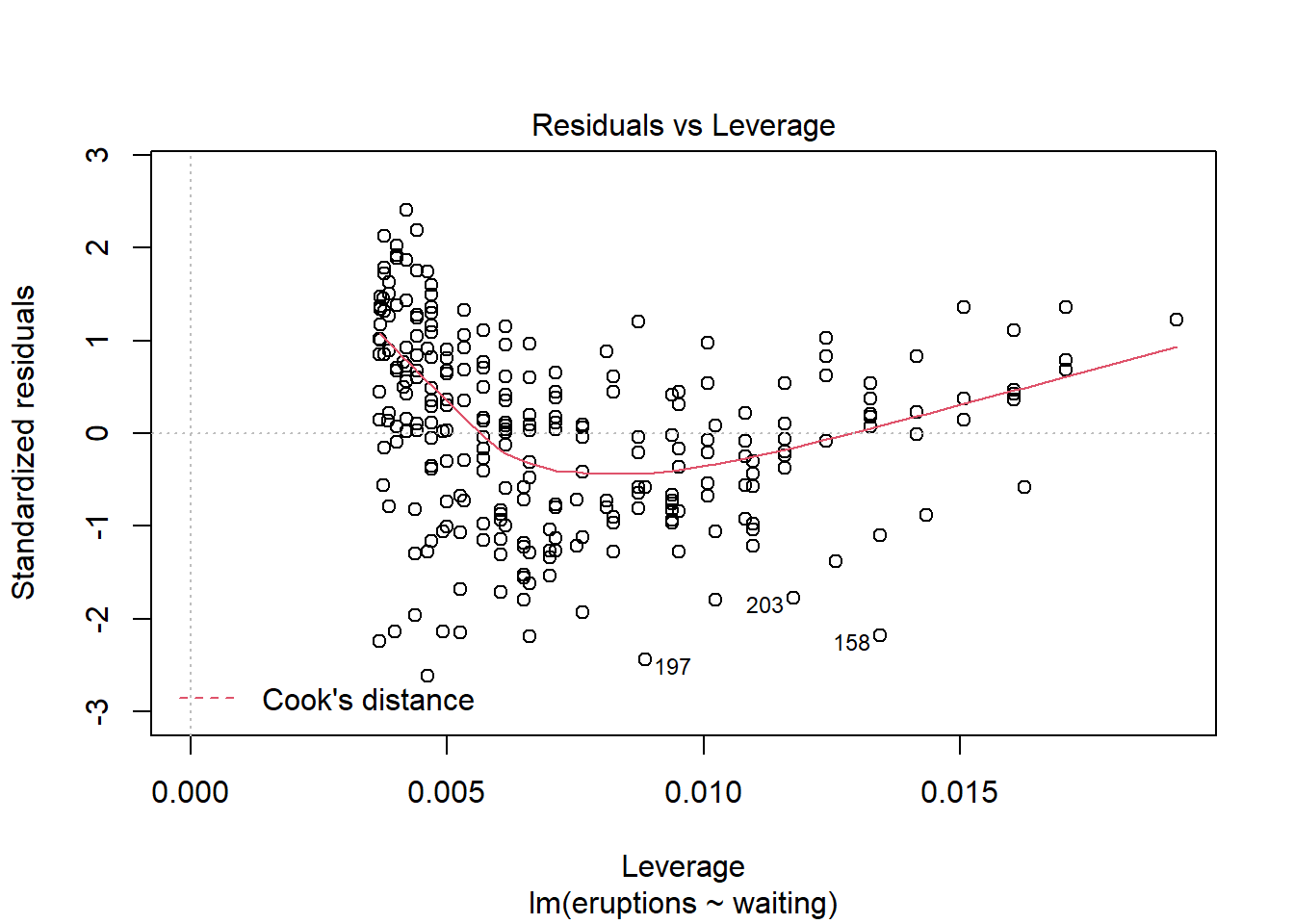
If you are running the commands in the console window of R Studio, you will be asked to press enter four times, to show various different diagnostic plots.
The fist plot shows you how the residuals vary with the fitted values (with the values of \(y\) predicted by the model at each value of \(x\)). If our model is correct, we should see no pattern here, and the residuals should be uniformly scattered on either side of zero with no trend evident. In this example, we do see a trend of a couple of lines from top left to bottom right, so perhaps we have reason to doubt our model is correct.
The second plot is known as a QQ (quantile-quantile) plot. This is assessing whether our residuals are normally distributed. If they are normally distributed, then most of the points are on the line and there is no trend visible. Here we see a slight trend at the beginning and the end, so there is some reason again to question how well our model fits.
The next plot shows us essentially what the first plot does, although we now see the square root of the standardised residual; essentially we should see no trend here either, as in the first plot; some people prefer to see a residual plot in this form.
The last plot can be ignored for now; this plot talks about how to find unusual observations (outliers), and we’ll come back to this later
Overall in this example we have to conclude that there is not a very good linear relationship between the waiting time for an eruption and the duration of the eruption. We will quantify this better as we proceed through this course
9.1.1 Formally stating the model.
Formally we are assuming that we have n pairs of data \((x_1,y_1),(x_2,y_2),\ldots,(x_n,y_n)\), and we suspect some relationship between them. We are fitting the model \[Y_i=\beta_0 + \beta_1 x_i +\epsilon_i,\,\,\,\mbox{where}\,\,i=1,2,\ldots,n.\]
We call \(\epsilon_i\) a random error. Standard assumptions about these errors are
- \(E(\epsilon_i)=0\) for all \(i=1,2,\ldots,n\),
- \(var(\epsilon_i)=\sigma^2\) for all \(i=1,2,\ldots,n\),
- The errors are independent of each other.
In other words, the errors have mean 0, fixed variance which we call \(\sigma^2\), and are independent.
We don’t focus too much on theory in these notes, but for a much more in depth view the book Linear Models in R is comprehensive.
9.1.2 Exercise 1: Tomatoes
The following data sets out the relationship between the amount of fertilizer applied to a tomato plant and the yield (eight) of tomatoes achieved.
fertilizer<-c(5,6,8,11,12,13,14,15,15,17,18)
yield<-c(18,20,21,25,24,27,30,31,31,33,29)- Fit a linear model to analyse the data here.
- Plot the data
- Find the correlation between yield and fertiliser.
- Assess the residuals to see whether the model is a good fit for the data.
## [1] 0.9412249.2 Testing Significance of Model terms
Returning to our old faithful dataset, we saw how to fit our line of best fit using the lm command. One question we might ask reasonably is whether this model explains the relationship.
In this case, we are claiming that when the waiting time between eruptions (X) changes, the duration (Y) also changes. We could test formally whether it could be the case that there is no relationship between (X) and (Y). If there is no relationship between X and Y, then the slope of the regression line would be zero, as shown by the red line in the plot. (The regression line we actually fitted is shown by the blue line).
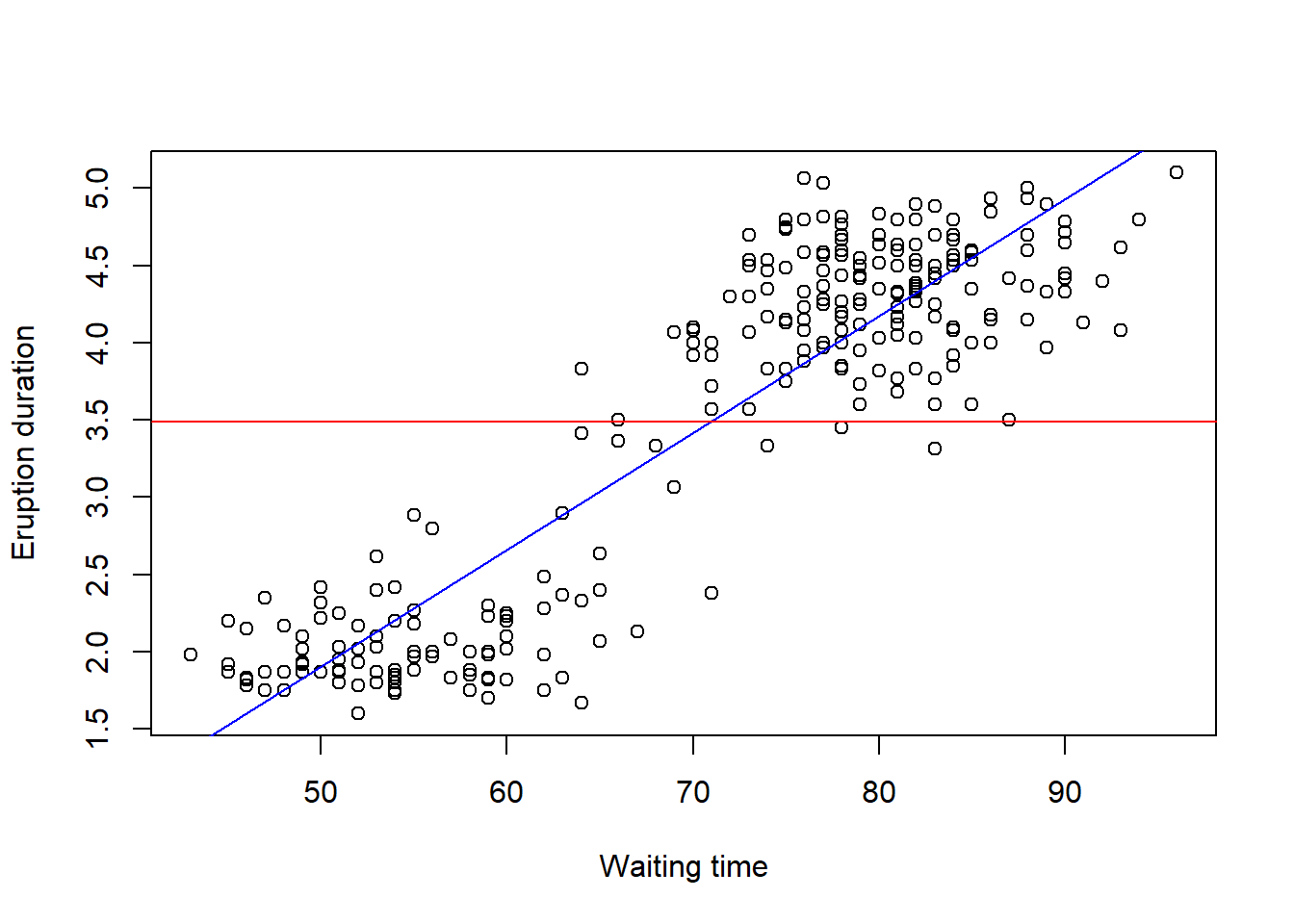
We formally then test the hypothesis about the slope as \[H_0:\beta_1=0 \quad vs\\H_1: \beta_1\ne 0\].
(Remember that our simple linear regression model is \[Y_i=\beta_0+\beta_1x_i+\epsilon_i\] for \(i=1\ldots n\), and assumptions that our \(\epsilon_i\) are independent with mean 0 and variance \(\sigma^2\))
It turns out that we can test this hypothesis by considering a t test with n-2 degrees of freedom (\(t_{n-2}\)). In R this is straightforward:
yellowstone.lm<-lm(eruptions~waiting,data=faithful)
summary(yellowstone.lm)
##
## Call:
## lm(formula = eruptions ~ waiting, data = faithful)
##
## Residuals:
## Min 1Q Median 3Q Max
## -1.29917 -0.37689 0.03508 0.34909 1.19329
##
## Coefficients:
## Estimate Std. Error t value Pr(>|t|)
## (Intercept) -1.874016 0.160143 -11.70 <2e-16 ***
## waiting 0.075628 0.002219 34.09 <2e-16 ***
## ---
## Signif. codes: 0 '***' 0.001 '**' 0.01 '*' 0.05 '.' 0.1 ' ' 1
##
## Residual standard error: 0.4965 on 270 degrees of freedom
## Multiple R-squared: 0.8115, Adjusted R-squared: 0.8108
## F-statistic: 1162 on 1 and 270 DF, p-value: < 2.2e-16we get a lot of information on the model. We focus here on the table under Coefficents
- The (Intercept) row refer to the intercept, \(\beta_0\).
- The waiting row refers to the slope, \(\beta_1\).
- The point estimates for these values and their standard errors are given in the first two columns of output
- The test statistic for a test whether the true value of the parameter is different from zero is given in the third column ‘(t-value)’, with the p-value of that test in the fourth column ‘Pr(>|t|)’.
- In this data, we test \(H_0:\beta_1=0\) vs \(H_1:\beta_1\ne0\). The value of the test statistic is 34.09, which has a p-value of \(2\times 10^{-16}\). i.e. it is vastly unlikely that the slope is zero, which means that there is a linear relationship between
waitinganderuptions. - The number of stars at the end is a shorthand to significance, based on the value in the final column calculated. Three stars is the most significant. The line below the coefficient table gives you R’s key- *** is between 0 and 0.001 so the p-value is between these values.
All this goes to show that the slope term is needed in our model- and there is overwhelming evidence to suggest that there is a linear relationship between waiting and eruptions.
We could also look at the intercept line to decide whether the intercept term \(\beta_0\) is necessary in the same way; however there is often less scientific interest in studying this. This would correspond to asking whether the time between eruptions is zero or not, which probably is clear.
9.2.1 Exercise 2: Lactic Acid
To calibrate an instrument which measures the lactic acid concentration in blood, an investigator used twenty samples of known concentration, x, and then obtained the concentration as measured on the instrument, y. The results are as below:
x<-c(1, 1 , 1 , 1 , 3 , 3 , 3 , 3 , 5 , 5 ,5 , 5 , 10 , 10 , 10 , 10,15 , 15, 15 , 15)
y<- c(1.1, 0.7, 1.8, 0.4, 3.0, 2.4, 4.9, 4.4, 4.5, 7.3, 8.2, 6.2, 12.0, 13.1 , 12.6 , 13.2, 18.7 , 19.7 , 17.4 , 17.1)
Read the data in as above. Then
- Use
plot(x,y)to plot y against x. Get into the habit of giving your plots titles. Hint: do ahelp(plot)to learn how to use themain,xlab,andylabcommands to add labels in R. - Does the relationship between y and x seem to be linear?
- What is the linear model and the assumptions usually made about the random error.
- Fit the model to the data by using the ‘lm’ command. Select ‘y’ as the response and ‘x’ as the predictor.
- Use the ‘abline’ command to plot a fitted line to your data.
- What would you expect to observe at x=0? Refit the model without intercept using
lactic.lm<-lm(y~x-1). - We should also check the model assumptions. Use the plot command with the linear model summary object : e.g
plot(lactic.lm). - Is the plot of residuals versus fitted values random? Note that because the \(x\) values are repeated this plot will have a number of vertical lines. We are looking to see if they are all of a similar spread, which will confirm that the errors have a constant variance, and all centred on zero, which will confirm that a model linear in \(x\) is appropriate.
- Use ‘qqnorm(resid(lactic.lm))’ to see the normal plot. Does the normal plot give a straight line? If so there is no need to doubt the assumption that the errors are normally distributed.
- One assumption we make in our normal model is that the residuals are independent of each other, and hence of the order in which they are collected. Use a ’plot(resid(lactic.lm)) to see the plot of the residuals against the order in which they are entered. Why is this likely to be unimportant for this example?
- Interpret the regression equation (model fit) in terms of the practical meaning of \(x\) and \(y\).
- Suppose a new sample has concentration \(x=7\). What would we estimate to be the value of \(y\)?
- Look at
summary(lactic.lm). Can you interpret the output? Test the null hypothesis that the slope is zero, versus the alternative hypothesis that it is nonzero for a significance level \(\alpha=0.05\). - Comment briefly, in non-statistical language, about the result of the test.
##        1
## 8.660556
##
## Call:
## lm(formula = y ~ x)
##
## Residuals:
## Min 1Q Median 3Q Max
## -1.71840 -0.78979 0.07438 0.74938 1.98160
##
## Coefficients:
## Estimate Std. Error t value Pr(>|t|)
## (Intercept) 0.06118 0.39157 0.156 0.878
## x 1.23144 0.04615 26.686 6.31e-16 ***
## ---
## Signif. codes: 0 '***' 0.001 '**' 0.01 '*' 0.05 '.' 0.1 ' ' 1
##
## Residual standard error: 1.047 on 18 degrees of freedom
## Multiple R-squared: 0.9753, Adjusted R-squared: 0.974
## F-statistic: 712.1 on 1 and 18 DF, p-value: 6.31e-169.3 Models that don’t fit
Up to now, we’ve focused on situations where the linear model fits quite well, but there are some clear signs of models that fit poorly that we can watch out for.
Firstly, just because a linear model’s terms are significant, doesn’t mean it is the best fit or even a sensible model. Consider this:
x<-seq(1,20,by=1) # Generate a sequence of integers from 1 to 20
y<-jitter(x^2) # y is x^2, with a small amount of noise
plot(x,y) 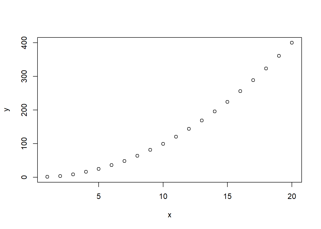
Clearly a straight line (simple linear regression) is not a sensible model, and we’ll see how to fit more complicated models in the next section. However if we try to build a linear model in the usual way:
silly.lm<-lm(y~x)
plot(x,y)
abline(silly.lm)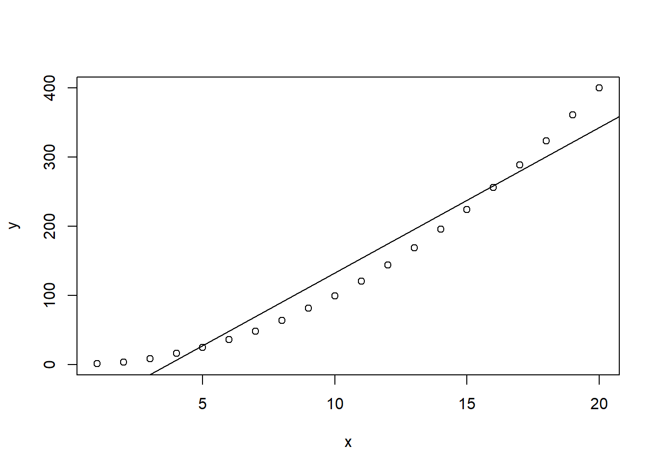
summary(silly.lm)##
## Call:
## lm(formula = y ~ x)
##
## Residuals:
## Min 1Q Median 3Q Max
## -33.571 -26.728 -7.846 22.560 57.361
##
## Coefficients:
## Estimate Std. Error t value Pr(>|t|)
## (Intercept) -76.820 14.514 -5.293 4.95e-05 ***
## x 20.981 1.212 17.317 1.14e-12 ***
## ---
## Signif. codes: 0 '***' 0.001 '**' 0.01 '*' 0.05 '.' 0.1 ' ' 1
##
## Residual standard error: 31.24 on 18 degrees of freedom
## Multiple R-squared: 0.9434, Adjusted R-squared: 0.9402
## F-statistic: 299.9 on 1 and 18 DF, p-value: 1.14e-12From the summary output alone, it looks like everything is significant- there are stars at the end of the (intercept) and x lines, and the p-values are very low, so we conclude that \(x\) is useful in helping us explain \(y\). However, this does not say that the model is any good. We have to look at the residuals to see problems:
plot(silly.lm)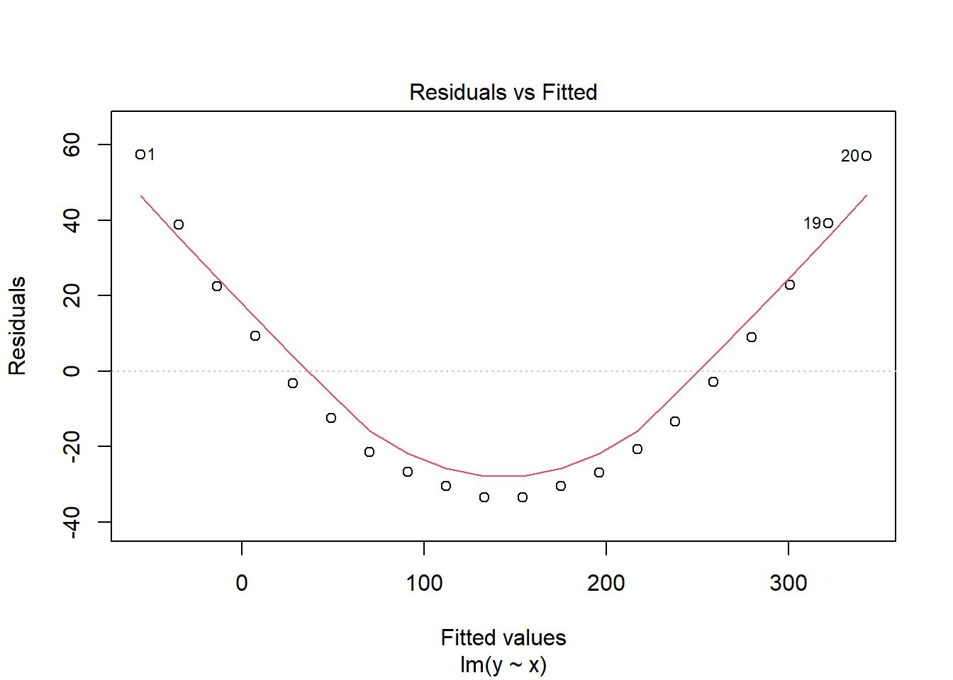
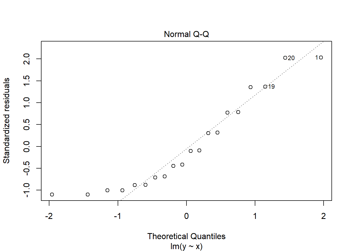
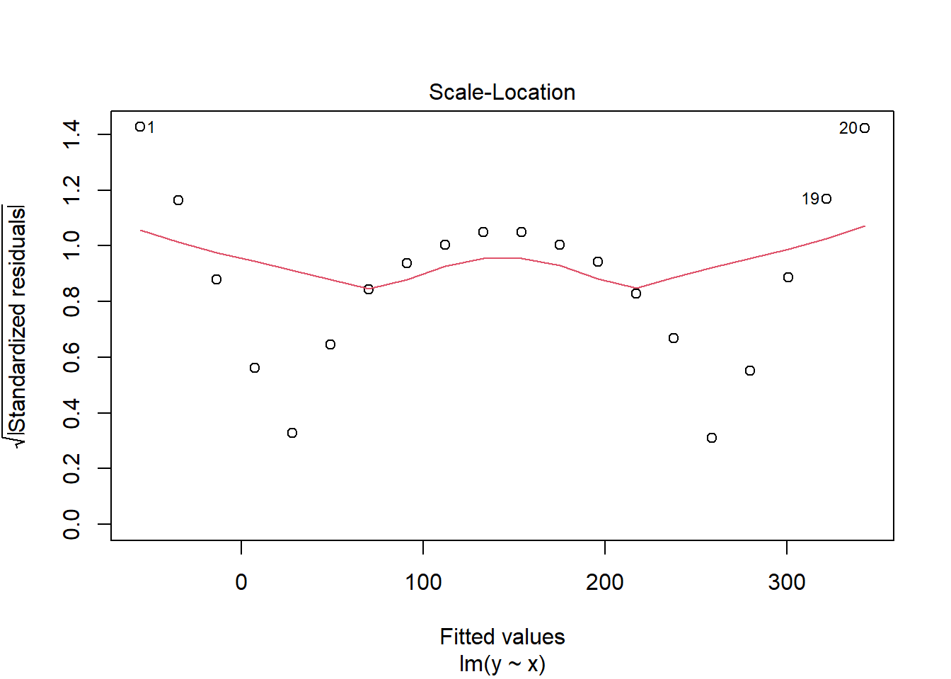
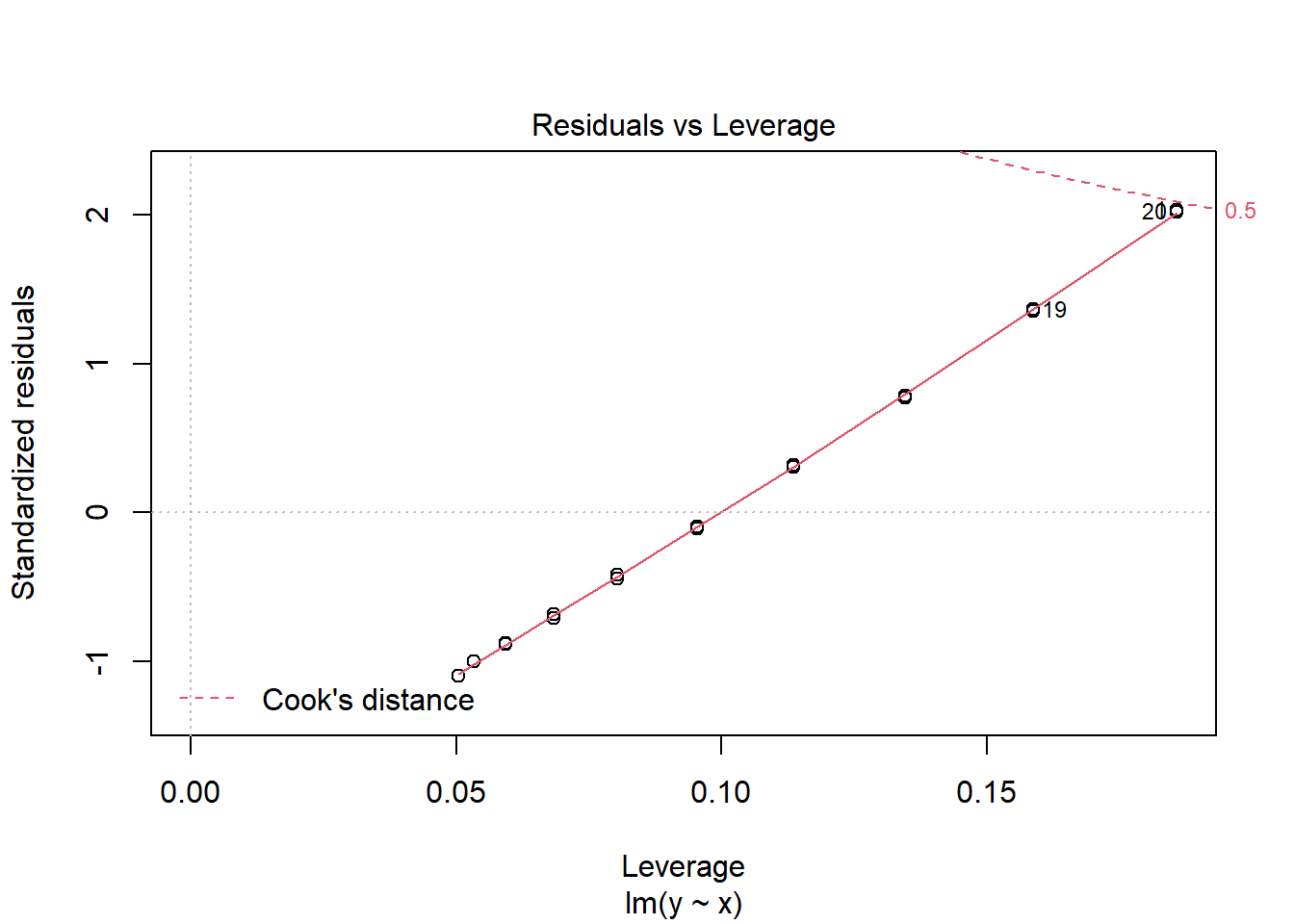 See the obvious pattern in the first plot! This is a good indication of the model not fitting well because our assumptions are not satisfied; our assumptions imply that our residuals should not depend on the fitted value of y, but clearly we see a u-shaped pattern in our residuals. This means we must question our linear model.
I spend a lot of time discussing residuals here- and you may feel too much- but studying the residual plots is often the only way to detect problems in the model. Certainly as we introduce more complicated models, it is not easy to see problems by eye.
9.3.1 Exercise 3: Fire Damage
A fire insurance company wants to relate the amount of fire damage in major residential fires to the distance between the residence and the nearest fire station. The study was conducted in a large suburb of a major city; a sample of fifteen recent fires in the suburb was selected. The amount of damage, \(y\) (£ 000), and the distance, \(x\) (km), between the fire and the nearest fire station are as follows:
x<- c(3.4 , 1.8 , 4.6 , 2.3 , 3.1 , 5.5 , 0.7 , 3.0 ,
      2.6 , 4.3 , 2.1 , 1.1 , 6.1 , 4.8 , 3.8)
y<- c(26.2 , 17.8 , 31.3 , 23.1 , 27.5 , 36.0 , 14.1 , 22.3,
19.6 , 31.3 , 24.0 , 17.3 , 43.2 , 36.4 , 26.1)- Plot the data.
- Write down the regression model the data suggest. Also, write the model assumptions.
- Fit the simple linear regression model to the data, plot the fitted line and write down its equation.
- Look at the residual plots, do they give any reason to doubt our model?
- Test the null hypothesis that the regression is not significant (the slope is zero) and interpret the result in non-technical language.
- Estimate the cost of the damage for a residence 3.5 km from the nearest fire station.
- Interpret the meaning of the slope and intercept parameters.
- Use R to form a 95% confidence interval for the slope.