OR-Notes are a series of introductory notes on topics that fall under the broad heading of the field of operations research (OR). They were originally used by me in an introductory OR course I give at Imperial College. They are now available for use by any students and teachers interested in OR subject to the following conditions.
A full list of the topics available in OR-Notes can be found here.
Data envelopment analysis (DEA), occasionally called frontier analysis, was first put forward by Charnes, Cooper and Rhodes in 1978. It is a performance measurement technique which, as we shall see, can be used for evaluating the relative efficiency of decision-making units (DMU's) in organisations. Here a DMU is a distinct unit within an organisation that has flexibility with respect to some of the decisions it makes, but not necessarily complete freedom with respect to these decisions.
Examples of such units to which DEA has been applied are: banks, police stations, hospitals, tax offices, prisons, defence bases (army, navy, air force), schools and university departments. Note here that one advantage of DEA is that it can be applied to non-profit making organisations.
Since the technique was first proposed much theoretical and empirical work has been done. Many studies have been published dealing with applying DEA in real-world situations. Obviously there are many more unpublished studies, e.g. done internally by companies or by external consultants.
We will initially illustrate DEA by means of a small example. More about DEA can be found here. Note here that much of what you will see below is a graphical (pictorial) approach to DEA. This is very useful if you are attempting to explain DEA to those less technically qualified (such as many you might meet in the management world). There is a mathematical approach to DEA that can be adopted however - this is illustrated later below.
Consider a number of bank branches. For each branch we have a single output measure (number of personal transactions completed) and a single input measure (number of staff).
The data we have is as follows:
Branch     Personal      Number of
           transactions  staff
           ('000s)
Croydon    125           18
Dorking    44            16
Redhill    80            17
Reigate    23            11
For example, for the Dorking branch in one year, there were 44,000 transactions relating to personal accounts and 16 staff were employed.
How then can we compare these branches and measure their performance using this data?
A commonly used method is ratios. Typically we take some output measure and divide it by some input measure. Note the terminology here, we view branches as taking inputs and converting them (with varying degrees of efficiency, as we shall see below) into outputs.
For our bank branch example we have a single input measure, the number of staff, and a single output measure, the number of personal transactions. Hence we have:
Branch         Personal transactions
               per staff member
               ('000s)
Croydon        6.94
Dorking        2.75
Redhill        4.71
Reigate        2.09
Here we can see that Croydon has the highest ratio of personal transactions per staff member, whereas Reigate has the lowest ratio of personal transactions per staff member.
As Croydon has the highest ratio of 6.94 we can compare all other branches to it and calculate their relative efficiency with respect to Croydon. To do this we divide the ratio for any branch by 6.94 (the value for Croydon) and multiply by 100 to convert to a percentage. This gives:
Branch        Relative efficiency
Croydon       100(6.94/6.94) = 100%
Dorking       100(2.75/6.94) = 40%
Redhill       100(4.71/6.94) = 68%
Reigate       100(2.09/6.94) = 30%
The other branches do not compare well with Croydon, so are presumably performing less well. That is, they are relatively less efficient at using their given input resource (staff members) to produce output (number of personal transactions).
We could, if we wish, use this comparison with Croydon to set targets for the other branches.
For example we could set a target for Reigate of continuing to process the same level of output but with one less member of staff. This is an example of an input target as it deals with an input measure.
An example of an output target would be for Reigate to increase the number of personal transactions by 10% (e.g. by obtaining new accounts).
Plainly, in practice, we might well set a branch a mix of input and output targets which we want it to achieve.
Typically we have more than one input and one output. For the bank branch example suppose now that we have two output measures (number of personal transactions completed and number of business transactions completed) and the same single input measure (number of staff) as before.
The data we have is as follows:
Branch       Personal       Business       Number of
             transactions   transactions   staff
             ('000s)        ('000s)
Croydon      125            50             18
Dorking      44             20             16
Redhill      80             55             17
Reigate      23             12             11
For example, for the Dorking branch in one year, there were 44,000 transactions relating to personal accounts, 20,000 transactions relating to business accounts and 16 staff were employed.
How now can we compare these branches and measure their performance using this data?
As before, a commonly used method is ratios, just as in the case considered before of a single output and a single input. Typically we take one of the output measures and divide it by one of the input measures.
For our bank branch example the input measure is plainly the number of staff (as before) and the two output measures are number of personal transactions and number of business transactions. Hence we have the two ratios:
Branch           Personal           Business
                 transactions       transactions
                 per staff member   per staff member
                 ('000s)            ('000s)
Croydon          6.94               2.78
Dorking          2.75               1.25
Redhill          4.71               3.24
Reigate          2.09               1.09
Here we can see that Croydon has the highest ratio of personal transactions per staff member, whereas Redhill has the highest ratio of business transactions per staff member.
Dorking and Reigate do not compare so well with Croydon and Redhill, so are presumably performing less well. That is, they are relatively less efficient at using their given input resource (staff members) to produce outputs (personal and business transactions).
One problem with comparison via ratios is that different ratios can give a different picture and it is difficult to combine the entire set of ratios into a single numeric judgement.
For example consider Dorking and Reigate - Dorking is (2.75/2.09) = 1.32 times as efficient as Reigate at personal transactions but only (1.25/1.09) = 1.15 times as efficient at business transactions. How would you combine these figures into a single judgement?
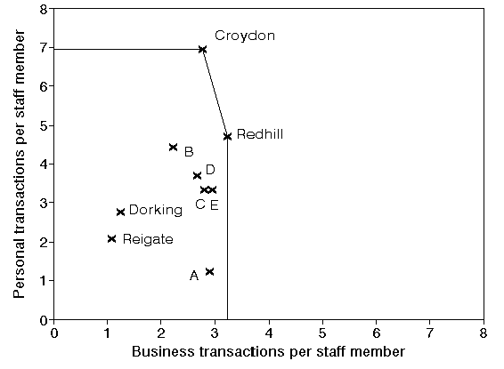
This problem of different ratios giving different pictures would be especially true if we were to increase the number of branches (and/or increase the number of input/output measures). For example given five extra branches (A to E) with ratios as below what can be said?
Branch           Personal           Business
                 transactions       transactions
                 per staff member   per staff member
                 ('000s)            ('000s)
Croydon          6.94               2.78
Dorking          2.75               1.25
Redhill          4.71               3.24
Reigate          2.09               1.09
A                1.23               2.92
B                4.43               2.23
C                3.32               2.81
D                3.70               2.68
E                3.34               2.96
For example - what can you deduce about branch C from these ratios?
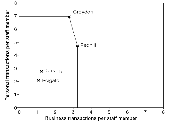
One way around the problem of interpreting different ratios, at least for problems involving just two outputs and a single input, is a simple graphical analysis. Suppose we plot the two ratios for each branch as shown below.
The positions on the graph represented by Croydon and Redhill demonstrate a level of performance which is superior to all other branches. A horizontal line can be drawn, from the y-axis to Croydon, from Croydon to Redhill, and a vertical line from Redhill to the x-axis. This line is called the efficient frontier (sometimes also referred to as the efficiency frontier). Mathematically the efficient frontier is the convex hull of the data.
The efficient frontier, derived from the examples of best practice contained in the data we have considered, represents a standard of performance that the branches not on the efficient frontier could try to achieve.
You can see therefore how the name data envelopment analysis arises - the efficient frontier envelopes (encloses) all the data we have.
Whilst a picture is all very well a number is often easier to interpret. We say that any branches on the efficient frontier are 100% efficient (have an efficiency of 100%). Hence, for our example, Croydon and Redhill have efficiencies of 100%.
This is not to say that the performance of Croydon and/or Redhill could not be improved. It may, or may not, be possible to do that. However we can say that, on the evidence (data) available, we have no idea of the extent to which their performance can be improved.
It is important to note here that:
Note too that the statement that a bank has an efficiency of 100% is a strong statement, namely that we have no other bank that can be said to be better than it.
Consider now Dorking and Reigate in the figure above. We can see that, with respect to both of the ratios Croydon (for example) dominates both Dorking and Reigate.
Plainly both Dorking and Reigate are less than 100% efficient. But how much? Can we assign an appropriate numerical value?
Consider Reigate, we have:
For Reigate the ratio personal transactions:business transactions = (23/12) = 1.92, i.e. there are 1.92 personal transactions for every business transaction.
By definition this figure of 1.92 is also the ratio of:
In other words (2.09/1.09) is also equal to 1.92
Consider the diagram below. You can see Reigate plotted on it. It can be shown that any branch with a ratio (personal transactions per staff member:business transactions per staff member) equal to 1.92 lies on the straight line from the origin through Reigate. You can see that line below. If you are geometrically minded then the slope (gradient) of this line is 1.92 - i.e. there are 1.92 personal transactions for every business transaction.

Hence if Reigate were to retain the same business mix (i.e. 1.92 personal transactions for every business transaction) but to vary the number of staff it employs its performance would lie on the line from the origin through its current position as shown above.
For example were Reigate to operate the same level of output with 9 staff we would have:
You can hopefully see from the diagram above that the point corresponding to personal transactions per staff member = 2.56 and business transactions per staff member = 1.33 lies on the line from the origin through the current position of Reigate.
It might seem reasonable to suggest therefore that the best possible performance that Reigate could be expected to achieve is given by the point labelled Best in the diagram above. This is the point where the line from the origin through Reigate meets the efficient frontier.
In other words Best represents a branch that, were it to exist, would have the same business mix as Reigate and would have an efficiency of 100%.
Then in DEA we numerically measure the (relative) efficiency of Reigate by the ratio:
100(length of line from origin to Reigate/length of line from origin through Reigate to efficient frontier)
For Reigate this is an efficiency of 36%.
The logic here is to compare the current performance of Reigate (the length of the line from the origin to Reigate) to the best possible performance that Reigate could reasonably be expected to achieve (the length of the line from the origin through Reigate to the efficient frontier).
Performing a similar calculation for Dorking we get an efficiency of 43%.
Recall the list of ratios with extra branches added given before.
Branch           Personal           Business
                 transactions       transactions
                 per staff member   per staff member
                 ('000s)            ('000s)
Croydon          6.94               2.78
Dorking          2.75               1.25
Redhill          4.71               3.24
Reigate          2.09               1.09
A                1.23               2.92
B                4.43               2.23
C                3.32               2.81
D                3.70               2.68
E                3.34               2.96
The diagram below shows the same diagram as before but with these five extra branches (A to E) added as in the above list of ratios. Plainly we could easily find their efficiencies from the diagram.
There are a couple of points to note here:
This issue of looking at data in a different way is an important practical issue. Many mangers (without any technical expertise) are happy with ratios. Showing them that their ratios can be viewed differently and used to obtain new information is often an eye-opener to them.
On a technical issue note that the scale used for the x-axis and the y-axis in plotting positions for each branch is irrelevant. Had we used a different scale above we would have had a different picture, but the efficiencies of each branch would be exactly the same. If you need convincing of this note that if we rescale the x-axis by a factor of k1, and the y-axis by a factor of k2, then the coordinates of any point (x,y) change to (k1x,k2y). Simple algebra and geometry reveal that in this case since a branch and the best point on the efficient frontier against which its efficiency is calculated lie on the same straight line though the origin the ratio (distance between the origin and the branch)/(distance between the origin and the best point) is unaltered by scaling.
The point labelled Best on the efficient frontier is considered to represent the best possible performance that Reigate can reasonably be expected to achieve. Whilst we have talked above of Reigate varying the number of staff to achieve Best in fact there are a number of ways by which Reigate can move towards that point. It can:
In fact the same diagram as we used to calculate the efficient of Reigate can be used to set targets in a graphical manner. Suppose we say to Reigate that, next time period, their target is to achieve an efficiency of 40% (i.e. effectively a 10% increase in current efficiency). We know where, on the line from the origin to Best, a branch with the same business mix as Reigate but an efficiency of 40%, lies. We can say to Reigate that their goal is to move from their current position to that new position, and the combination of input/output changes necessary to achieve that is left up to them.
It is important to be clear about the appropriate use of the (relative) efficiencies we have calculated. Here we have:
This does NOT automatically mean that Reigate is only approximately one-third as efficient as the best branches. Rather the efficiencies here would usually be taken as indicative of the fact that other branches are adopting practices and procedures which, if Reigate were to adopt them, would enable it to improve its performance.
This naturally invokes issues of highlighting and disseminating examples of best practice.
Equally there are issues relating to the identification of poor practice.
In DEA the concept of the reference set can be used to identify best performing branches with which to compare a poorly performing branch. Consider Reigate above. The Best point associated with Reigate lies on the efficient frontier. A branch at this point would be the best possible branch to compare Reigate with as it would have the same business mix. No such branch exists however so we go to the two efficient branches either side of this Best point. These branches, Croydon and Redhill, are the reference set for Reigate.
The reference set for any branch with less than 100% efficiency consists of those branches with 100% efficiency with which it is most directly comparable. Broadly put this means that the branches in the reference set have a "similar" mix of inputs and output.
What other reasons can you think of for the (apparently) low relative efficiency score for Reigate?
Consider the diagram above with branches A to E included. What would be the efficiencies and reference sets for branches A to E?
Suppose now we have a extra branch F included in the analysis with personal transactions per staff member = 1 and business transactions per staff member = 6. What changes as a result of this extra branch being included in the analysis?
The effect of this can be seen below
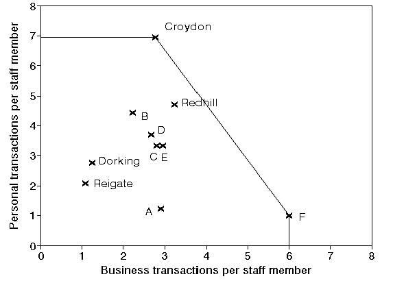
Note that the efficient frontier now excludes Redhill. We do not draw that efficient frontier from Croydon to Redhill and from Redhill to F for two reasons:
In the above it is clear why Croydon and F have a relative efficiency of 100% (i.e. are efficient), both are the top performers with respect to one of the two ratios we are considering. The example below, where we have added a branch G, illustrates that a branch can be efficient even if it is not a top performer. In the diagram below G is efficient since under DEA it is judged to have "strength with respect to both ratios", even though it is not the top performer in either.

Note here that in the above diagram the "feasible space" in which a single branch might lie and still achieve 100% efficiency without being a top performer in either ratio is quite large (any branch inside the triangle formed between the horizontal line though Croydon, the vertical line though F and the line joining Croydon to F).
Let us recap what we have done here - we have shown how a simple graphical analysis of data on inputs and outputs can be used to calculate efficiencies.
Once such an analysis has been carried out then we can begin to tackle, with a clearer degree of insight than we had before, issues such as:
In our simple example we had just one input and two outputs. This is ideal for a simple graphical analysis. If we have more inputs or outputs than drawing simple pictures is not possible. However it is still possible to carry out EXACTLY the same analysis as above but using mathematics rather than pictures.
In words DEA, in evaluating any number of DMU's, with any number of inputs and outputs:
For those of you who are comfortable with mathematics the mathematics for the simple four branch example given above is presented below.
To calculate the efficiency of Dorking (for example):
maximise EDorking
subject to
ECroydon=(125Wper + 50Wbus)/(18Wstaff)
EDorking=(44Wper + 20Wbus)/(16Wstaff)
ERedhill=(80Wper + 55Wbus)/(17Wstaff)
EReigate=(23Wper + 12Wbus)/(11Wstaff)
0 <= ECroydon <= 1
0 <= EDorking <= 1
0 <= ERedhill <= 1
0 <= EReigate <= 1
Wper >= 0
Wbus >= 0
Wstaff >= 0
where:
To calculate the efficiency of the other branches just change what you maximise (e.g. maximise ERedhill to calculate the efficiency of Redhill). You can see here how we associate non-negative weights with each input and output measure.
The above optimisation problem is a nonlinear problem and hence, at first sight, difficult to solve numerically. In fact it can be converted into a linear programming problem. To do this we:
Doing this with the above optimisation problem for Dorking we get:
maximise (44Wper + 20Wbus)/(16Wstaff)
subject to
(16Wstaff) = 1
0 <= (125Wper + 50Wbus)/(18Wstaff)
<= 1
0 <= (44Wper + 20Wbus)/(16Wstaff) <=
1
0 <= (80Wper + 55Wbus)/(17Wstaff) <=
1
0 <= (23Wper + 12Wbus)/(11Wstaff) <=
1
Wper >= 0
Wbus >= 0
Wstaff >= 0
The above is a linear program after rearrangement - namely:
maximise (44Wper + 20Wbus)
subject to
(16Wstaff) = 1
(125Wper + 50Wbus) - (18Wstaff) <=
0
(44Wper + 20Wbus) - (16Wstaff) <= 0
(80Wper + 55Wbus) - (17Wstaff) <= 0
(23Wper + 12Wbus) - (11Wstaff) <= 0
Wper >= 0
Wbus >= 0
Wstaff >= 0
where we have substituted (16Wstaff) = 1 into the objective and rearranged the constraints. Once this LP has been solved to generate optimal values for the weights then the efficiency of the branch we are optimising for, Dorking in this case, can be easily calculated using EDorking=(44Wper + 20Wbus)/(16Wstaff).
Note here that the numerator of (44Wper + 20Wbus)/(16Wstaff) is known as the weighted output for Dorking and the denominator is know as the weighted input for Dorking.
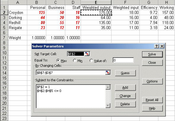
Below we solve the above DEA problem with the Solver add-in that comes with Microsoft Excel.
If you click here you will be able to download an Excel spreadsheet called dea_lp.xls that already has the DEA LP we are considering set up.
Take this spreadsheet and look at Sheet A. You should see the problem we considered above set out as:
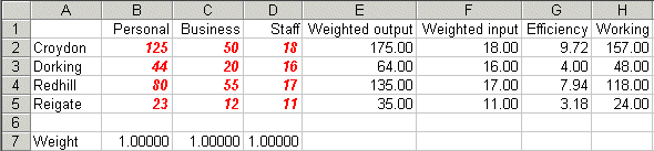
Here the weights that we need to decide are in cells B7 to D7 (all weights set equal to one for illustration). The weighted output for each DMU is given in column E and the weighted input in column F. The efficiency for each DMU (given the current weights) is calculated in column G and column H is the difference between the weighted output and the weighted input. This is a working column that we will need when invoke the Solver model - recall that in our LP above our constraints include the fact that weighted output minus weighted input must be <= 0.
Note here that the current weights are not feasible - they result in efficiencies greater than one.
To use Solver in Excel do Tools and then Solver. In the version of Excel I am using (different versions of Excel have slightly different Solver formats) you will get the Solver model as below:

Here the target cell is E3, the weighted output for Dorking, which we wish to maximise (ignore the use of $ signs here - that is a technical Excel issue if you want to go into it in greater detail) We can change cells B7 to D7, the weights, and the constraints are that cell F3 must equal one (this is the weighted input for Dorking) and that cells H2 to H5 must be <= 0. These cells contain the difference between weighted output and weighted input.
If you click Options in the Solver box you will see:

where both the 'Assume Linear Model' and 'Assume Non-Negative' boxes are ticked - indicating we are dealing with a linear model with non-negative variables.
Solving via Solver the solution is:

indicating that the efficiency of Dorking is 43% (as we saw previously above).
Now look at Sheet B in dea_lp.xls and do Tools and Solver. You should see:
where the difference from before is that now we are maximising cell E2, the weighted output associated with Croydon, and we have a constraint relating to cell F2, the weighted input for Croydon. Solving we get:

indicating that the efficiency of Croydon is 100%.
Value judgements
One thing that can happen in DEA is that inspection of the weights that are obtained leads to further insight and thought. For example in our initial Solver solution above we had a weight Wper associated with personal transaction of 0.00304 and a weight Wbus associated with business transactions of 0.01489 - implicitly implying that business transactions have an importance equal to 0.01489/0.00304 = 4.9 personal transactions.
Now it may be that after considering this ratio of 4.9 that bank management consider that, as a matter of judgement, business transactions are much more time consuming/valuable than personal transactions and as such they would like the weights Wper and Wbus to satisfy the constraint Wbus/Wper >= 12 implying that one business transaction is worth at least 12 personal transactions. This constraint is a value judgement to better reflect the reality of the situation.
We can add this constraint to our Solver model, as below in Sheet C in dea_lp.xls, where the ratio Wbus/Wper is in cell B9.
Note that in order to have the ratio constraint Wbus/Wper >= 12 satisfied we need to transform it into a linear constraint - namely Wbus - 12Wper >= 0 and the expression Wbus - 12Wper is in cell B10

Solving we get:

indicating that the efficiency of Dorking falls to 41% when this constraint (value judgement) is added.
More about extending DEA to incorporate value judgements into a DEA model (also known as adding weight restrictions to a DEA model) can be found here.
The first step in a DEA study requires the inputs and outputs for each DMU to be specified. This involves two key conceptual questions, the answers to which may not be at all obvious.
DMU's are compared one to another. Hence they must be engaged in a similar set of operations. For example it would be silly to compare a bank branch to a supermarket as they do radically different things.
By this we mean what conceptually are they, in words. We do not, at this stage, require numeric values.
Obtaining numeric values for each input/output measure, for each DMU, comes later.
Needless to say you do not need to be able to do mathematics to perform DEA studies. Software is available to help you. For example:
By way of an example of the use of DEA I have been involved in a study that aimed to apply DEA. The company concerned had a large system of pipelines controlled and monitored by 12 different (regional) control rooms (each manned 24 hours a day, 7 days a week) on the British mainland. The purpose of these control rooms was to ensure both safety (as the material moved through the pipelines had a potential for explosion) and supply (the material moved had to be available when consumers wanted it).
The company was concerned to see if DEA could shed any light on the relative performance of these control rooms. After a (relatively) long meeting they identified (conceptually) four input measures and one output measure for each control room (each DMU). They then found that their current systems were not collecting data on these input/output measures and so a data collection exercise was set up (running over some six weeks) and new systems introduced to ensure that such data was automatically collected in the future.
These four input measures were the number of messages sent to a control room (from four different sources). These messages would appear on the operator screens. The operators would then either initiate a control action, i.e. do something in response to the message, or not. Not all messages needed a control action, some were just seen by the operators and formed a part of their overall view of how the system was behaving. These control actions were the output measure. Hence there were four input measures and one output measure.
Analysing the data proved an interesting exercise. Note that an implicit assumption in DEA is that there is some connection between the input and the output. To emphasise this point I could generate completely random data for two input measures and one output measure and perform a similar analysis to that performed above for the bank branch example. That analysis would purport to show efficiencies, the efficient frontier, etc. However it would be completely wrong as there was never any relationship between the input and the output - that is what generating random data means!
There is a statistical technique called correlation which enables us to test for a statistical relationship between two variables and when this was used to test the relationship between each of the four input measures and the single output measure it was found that:
In fact, after this analysis, the company never really applied DEA, after all they had effectively one significant input and one significant output. In other words although they had embarked on a study aiming to use DEA the insights they gained were really from data collection and analysis, not directly from DEA. This illustrates that the outcome of a study may not be what you expect! However without the impetus to apply DEA it is doubtful that the company would ever have started to look in detail at what was happening in regard to their control rooms on a comparative basis.